EllaDavey 2518
Saturday, 5 May 2012
Tuesday, 27 March 2012
In this lesson we revisited media technical terms and applied our knowledge about media language when analysing the short film 'Smashed' written and directed by Peter Snelling.
When I first wrote the essay i came across several difficulties however when redrafting my essay I over came these problems and my grade increased from a C to a B. I achieved this grade increase,by using media language such as;
Here below is my completed essay;
My targets for my future essays would be to make sure my paragraphs are structured, well written and organised. This will help my essay because I will be able to explore specific elements in more detail and then in turn relate everything back to the question.
When I first wrote the essay i came across several difficulties however when redrafting my essay I over came these problems and my grade increased from a C to a B. I achieved this grade increase,by using media language such as;
- 'The council flat backdrop signifies the status and background of the characters'
- 'The council flat backdrop portrays the status and background of the characters'
By changing portray to signify I am showing the marker that I understand conceptual language and how to use it in my essay
Here below is my completed essay;
My targets for my future essays would be to make sure my paragraphs are structured, well written and organised. This will help my essay because I will be able to explore specific elements in more detail and then in turn relate everything back to the question.
Friday, 9 December 2011
Saturday, 19 November 2011
Thursday, 17 November 2011
Research and planning grade: 17/20
 To aim for 20/20:
Upload sample scene
Upload any Facebook planning (screenshots)
We will work together on your reflective writing to develop
Looks great so far - well done!
Thursday, 10 November 2011
This is the photo we plan to use for our film poster. We chose this photo because we believe it sums up and signifies the genre horror and also gives the audience an insight to what our film may be about for example; setting as the photo is shot in a forest same place to where the film is shot.
When designing our film poster we came up with the idea inspired from photo booths 'tunnel' effect to have Beth's face in the middle of the poster then her surroundings blurred so all the audiences attention would be focusing on her.
We first attempted to create this effect using photoshop and the blur tool as you can see. However we had difficulties creating the correct effect we wanted because of our lack of knowledge in photoshop.
One of the students in our class told myself and Ciara about a new media technology website called 'picnik' created to make editing photos easier. The website unlike photoshop was very simple and straight forward to with instructions step by step telling how to edit your chosen picture. It also allowed you to edit the contrast, opactity, colour, size etc of your uploaded photo.
Here is our photo after editing using picnic as you can see we applied a blur effect to the outside of
We then uploaded the picture onto photoshop so we could add the credits and release date. We decided to use the colour white because it standed out the most against our background picture. We also decided to make the release date bold so it would stand out and catch the audiences eye.
We looked on photoshop however we couldn't find an appropriate text so using another new media website called 'dafont.com' we downloaded a free font called '28 days later' and installed it on to photoshop to use for our film poster.
Wednesday, 9 November 2011
After researching into horror film posters and learning about typical conventions used to engage the audience. Myself and Ciara began creating our own designs and sketched out a few more of our designs.
NEED TO UPLOAD SKETCHES
As you can see similar to the film posters we annotated our sketches include a main photo signifying to the audience the genre of the film, such as the main characters face (Jess) this also gives the audience an indication to the main protagonist of the film. It also will include a title, credits, release date etc;
Monday, 7 November 2011
I annoated two film posters in the same style as our film so i would have an understanding of the rquirements and all of the typical conventions of film posters such as;
- title
- credits
- release date
- images
- slogan
We then looked in further detail and spoke about these conventions and how they all complement each other and represent different meanings and genres films . I felt that this was a very helpful task as it gave me an incite into the conventions used in film posters, giving me ideas of colours and fonts to use when making our poster.
Below are two annoated film posters;
Because our film poster will be made using photoshop i began had a practising using the tools on photoshop to create text. I used the colours of a ouja board which is linked to our film. I found getting to grips with photoshop quite difficult as i did not fully understand how to carry out function such as the blur tool or cropping even though i have used it previously.
Friday, 28 October 2011
In order to receive feedback from myself and Ciara's idea for our short film, we produced a short presentation including a short sample scene, story board and proposal. We presented to the class firstly giving them a quick summary of the proposal, so we explained the plot, the cost, and locations we had in mind for our film. We then showed the class our story board for them to gain an even greater insight to our idea and to understand the different camera angles, lightening and sound that we plan to use.
We received a range of feedback from positives too crictisms. After the presentation myself and Ciara watched the presentation again to gain a full understanding of the feedback. Our class said we should add quiet atmopsheric music when the characters are being watched to add tension and to create more of an dramatic effect.
To shoot the writing on the wall scene we planned to use a chromakey suit however this idea turned out to be unsuccessful, instead from the feedback from our presentation we were given the idea of taking indiviual shots of each letter of the word "beware" then adding them together to create a disjointed, jiggered animation.
Monday, 24 October 2011
We shot our sample scene so that we could test serval elements of our film for example the chromakey suit and also the lighting in the abandoned house. We then using our skills from last year edited our short film in final cut ready for our presentation to the class. When filming our sample scene we noticed that by 5.00pm it got extremley dark affecting the quality of the shots. To overcome this problem for our main film we will make sure we film before 4.00pm to get the best quality possible.
Friday, 21 October 2011
After using garage band previously in year 12, i had a basic understanding of how it works. In todays lesson myself and Ciara experimented with different sound effects that we could use for our film in order to create tension or to frighten the audience. We found a range of atmospheric effects that would be suitable for out film because the music we use cannot be copyrighted.
To the left is a image of Garage band open.
To the left is a image of Garage band open.
Tuesday, 18 October 2011
After annotatating a six stills from another film, we created a ten shot story board for our own. Including all the camera angles, lighting, mise-en scene and sound for our film. We found it diffuclt at first to explain and decide on each of the camera angles to use because we are using two cameras in the film an hand-held one and a main camera. However with the feedback from the class and several re drafts we overcame this problem.
story board
story board
Friday, 14 October 2011
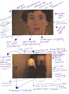
To gain greater understanding of short film techniques and what goes into a shot list I annotated a short horror film from virgin shorts. At first i found annotating the shots quite difficult and forgot about sound and lighting however after redrafting i over came this problem and now i know what exactly what needs to be written for a shot list.
Below is the six still shots;

Below is the six still shots;

Monday, 3 October 2011
Tuesday, 27 September 2011
Today were told about our future media coursework project and chose our groups for it, my partner is Ciara Murray.
At first we struggled with coming up with a concept for our film. We decided to use the genre horror since we had the most knowledge on that style from the film "The Insane".
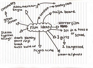
 We developed our ideas through brainstorming and created a spider diagram.
At first we struggled with coming up with a concept for our film. We decided to use the genre horror since we had the most knowledge on that style from the film "The Insane".
 We developed our ideas through brainstorming and created a spider diagram.
Wednesday, 21 September 2011
Friday, 16 September 2011
As a class we watched a short film horrow film called "The Insane" and then annaysled the film in an essay format answering the following question.. Does "The Insane" use media language effectivley to meet the conventions of the horror genre?
In my first draft of the essay I managed to get 76% equalling a B which i was very pleased with because i have improved from my previous essay. I found watching "The Insane" was very useful as it allowed me to gain greater knowledge of short film editing and camera skills.
In my first draft of the essay I managed to get 76% equalling a B which i was very pleased with because i have improved from my previous essay. I found watching "The Insane" was very useful as it allowed me to gain greater knowledge of short film editing and camera skills.
Thursday, 15 September 2011
Subscribe to:
Comments (Atom)


